Buzz Saw by Deb Pulford (CT)

Deb's layout uses lots of colour and layered panels to tell the story of the Buzz Saw. Paper folding, edging and rounded edges keep the layout simple. The black Ric Rac breaks it up nicely too, in line with the stripes. Well done Deb.
My Friends by Beth Metcalf

Beth has used a great mix of colours on her layout. The layered flowers look great, and a bit of black doodling defines the edges. The ruffled trim softens the layout even more, and the chip shapes add texture and depth. It's great to have the kids do their own journalling too (this is half of a double page). Well done Beth.
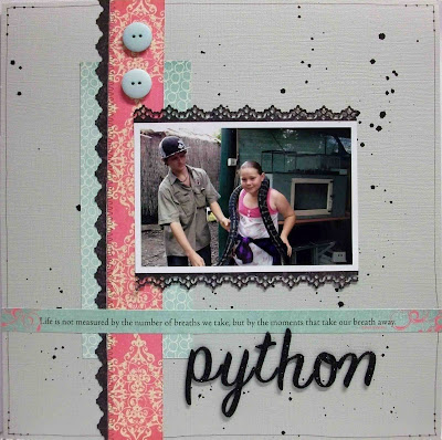
Python by Anita Bownds (CT)

Keep posted, we have more to share!
Janet

3 comments:
Your folded circles look great Deb and the papers go so well with the fun theme. Love the way you've layered the chipboard flags Beth - all the muted colours look lovely against the light grey Anita. Not sure about that snake though!
super layout Deb,love all the layered panels..
wow Beth absolutely love all your cut out flowers they look great..
Thanks Claire..
hugs Anita..xx
Deb, the folded circles look great and its a great way to show both sides of the paper!
Beth, the layered chip looks awesome and the large flowers look great.
Anita, love how the border punch matches the markings on the snake.
Post a Comment