Apr 30, 2014

April ScrapBurst Post #10

SB #3 Something Rural with Texture
Rustic by Jennie Seal (CT)
How good does this page look?  That water tank background paper has worked a treat, blending in really well with the overall theme for those earthy, rustic wire coils.  The screw brads always look good on a male or rustic page, and also the wooden gears.
These gorgeous little die cut birds are touched up with a bit of glossy accents, whilst the gauze in the corner has been coloured and scrunched for texture.
Wood and metals embellies are a nice team to compliment a rustic page, and these all work well, right down to the chain.  Well done Jennie.
Layout by Roz Langridge
It's great to see all these wonderful old photos coming out for the ScrapBursts.  These harvest photos are giving us all a chance to see how much our lives have changed over time, and appreciate our heritage.  Love the photos.
Now these may be a little difficult to see, but the wheat is handmade with tissue paper.  They look fantastic, and add to the texture of the corrugated backing cardboard.
The grass reeds have been cut from a die, and give the page plenty of movement with a great feel of the outdoors.  The little bird is really cute, and I love how this has come together.   Great work Roz. 
CB #1 Baby Girl
Hello Baby Card by Jennie Seal (CT)
Jennie's baby girl card has been given added depth and texture with dry embossing dots, and die cut onesies and the pram.  A little mounting tape and they help the card to "pop".  Well done Jennie.
SB #2 Vintage/Heritage
Memory by Di Corbitt
Di is another of our ladies who have a great range of heritage photos, and this is a wonderful photo of her mother as a child, on her mother's knee.  The papers reflect the colours and theme to suit the era, with an eclectic mix of tags and embellishments to match.  The layout has been kept simply minimal, with the full focus on the photo.  Well done Di.

Thanks for sharing girls.
Janet

April Sketch Post #6

Hello all, here is our next Sketch post.  I hope you are enjoying all the work that these creative girls are putting in.
Happy Snap by Jennie Seal (CT)
Jennie's layout uses natural colour tones with a background of white space. The brown hues are a lovely compliment to the textures in the patterned papers, and Jennie's added elements.

Lots of die cut cogs create a background to the film strip, which displays a succession in growth years of her favourite son.
All the fussy cutting to the edges of the woven paper leaves a rawness to it's edging.  The stamping at the bottom adds texture once embossed, adding another layer.  A great interpretation of the sketch Jennie, well done.

Have a Wonderful Day Card by Zan Boyle
Zan has used such a lovely quote on her card.  Layering with different elements gives it direct focus, drawing focus to the meaning.  The colours coordinate perfectley, well done Zan.
A Perfect Day by Di Corbitt
Di has turned her sketch, using her photos along the bottom instead.  Replacing cogs with ladybirds and scallops has given the layout a different look, more suitable to Di's girly photos.  The colours also work well together, thanks Di.

Great to see so many entries, thanks to everyone for playing along.
Janet

Apr 29, 2014

April ScrapBurst Post #9

CB #3Washi/Stamps
Time to Celebrate Card by Zan Boyle
What a versatile Washi this is, it just keeps popping up all over the place.  Clock faces, watches, steampunk, it's all so out there at the moment.  Zan has done a great job with her stamping, use of Washi and fussy cutting.
SB #1 Numbers
Tayla Turned Six Today by Di Corbitt
It's all about the pink!  Di has used lots of pink and girly touches to create Tayla's birthday layout.  The birdcage stamp in the background blends in nicely, and all the little embellies add to girls' fun day.
SB #4 White with Light Blue & Lines
Alfie by Roz Langridge
Roz has put up a lovely page of Alfie, using basic elements to highlight the criteria.  The blue and white circles look great layered and blinged up, and the addition of the stripes fits in with the lines.  This has come together very nicely, well done Roz.
CB #3 - Washi/Stamps
Happy Birthday Card by Jennie Seal (CT)
Jennie has shown us the extend of a good Washi supply!  The colours are vibrant and colourful, with a friendly feathered fellow on the front.  Also a good way to use up those last little bits and strips.  Well done Jennie, bright and fun.

Thanks for looking.

April ScrapBurst Post #7 & Sketch Post #5

Today we have a mixed post, sharing a bit of ScrapBurst challenges, and also the April Sketch. It's been great seeing so much variety this time around, I hope you're enjoying the posts.


SB #1 Numbers
Joc and Booties Visit by Zan Boyle
Zan has turned her hand to a bit of fussy cutting with this challenge. The background patterned paper has lent itself well to the use of hex stamps to work in with the theme.
A cluster of tags brings in a cluster of colour, and a backing for the title tag. The staggered overlaying of the photos ties the top and bottom of the layout in.
The richness of the stamp brings in enough depth to capture the eye, and relate the pattern to the themed hexagons. Well done Zan.

Sketch Challenge
Puppy Love by Helen Triglone
Helen has used lots of stamping & embossing to theme her page. Sponging the page with soft browns has taken the edge off a stark white background, and works well with the rest of the elements. The photos are great and lift the page with their sharp coloring.
This is a great use of the hessian, with the bakers twine added for colour and texture. The eclectic title is a great way to maximize your extra letters.
The simplicity of punching and layering shapes can give you such a variety of combinations, and Helen has done just that to mount her photos and background scallop shapes. The little calendar stamp is so useful for a journaling your dates. Well done Helen, lovely layout of your Fur Babies.

CB #1 Baby Boy/Girl Card
With Love by Dawn Collins
Dawn's card is backed with a lovely dry embossed pattern, setting a nice soft background. The image block and sentiment are mounted on top for a little depth. A couple of coordinating flowers and vines add colour to a lovely baby card.

CB #2 Vintage/Doilies
Love Is by Gail Tuttle
Gail has used a die cut doily on her vintage card. With a lovely sentiment mounted up, and some fussy cut vintage birds over lapping, this card is all about the simplicity of the sentiment. Well done Gail.

Thanks for sharing girls, we still have lots more to share so be sure to check back!
Janet

April ScrapBurst Post #8

We have a couple more ScrapBurst challenges to share with you today.  You still have time to get yours in, so be sure to email your images, or drop them into the store.
CB #2 Vintage/Doilies
Wedding Card by Zan Boyle
SB #1 - Numbers
We're Happy Happy Happy by Helen Triglone


And we still have lots more to share before Pumpkin Time, so be sure to keep watching.

Apr 23, 2014

April ScrapBurst Post #6

SB #2 Vintage/Heritage
Generations Down the Line by Zan Boyle
Zan has used muted tones of apricot and white to support her story of generation photos.   The painted decorative chip frame adds to the theme.
The doilies are a nice background for the floral cluster, with a variety of handmade paper and fabric flowers.  Added in are some metal charms and pearl brads.
A lovely little envelope holds the title tag, secured with a little wooden flourish.  Well done Zan.
CB #1 Baby Girl Card
Special Wishes Card by Deb Blunden
Deb has used a classic pink gingham pattern on her baby girl card, then embellished with teddy cutouts, daisies and an edge punch.  The organza ribbon is soft and delicate, well done Deb.
CB #4 White with Light Green
Thinking of You Card by Zan Boyle
The border punch gives a lovely effect, especially when it's layered.  The shaping of the vine gives it more movement and dimension.  Adding a cotton doily into the mix with the paper flower layers makes the card a little more feminine, and breaks the colours more, blending into the white background.  Lovely Zan, well done.

We still have lots more to share, so stay in touch!
Janet

Apr 19, 2014

ScrapBurst Post #5

CB # Baby Girl Card
Baby Girl Card by Zan Boyle
Zan has created her card as a mini booklet.  The cover has been decorated with flourishes cut using the Cricut, in an alternate shade of pink.
Using a variety of cutouts from the Cricut and stickers, Zan has alternated each page differently.
And on the alternating page the pattern continues for a very girly baby booklet.  A great way to celebrate baby's arrival, with plenty of room on the back as well for the addition of photos.  Well done Zan.

Janet

Apr 18, 2014

April ScrapBurst Post #4

SB #3 Something Rural with Textures
Jondaryon Woolshed by Zan Boyle
Rockin' page.........  Zan has done some awesome fussy cutting, cleverly disguised with textured sand and inking!  A very dimensional page with lovely elements.
The photos are layered against the differing depths of the rocks, and seated nicely between the embossed woodgrain panels and the deep blue spotted paper.
A closer look here gives you a better idea of how the rocks have all been cut and layered.  The sand looks awesome too.
The mini alphas work well as the title, and an avid journaller, Zan has made sure to add in all the details of the days travels.  Well done Zan, great job.

SB #  White with Light Blue & Lines
Tying The Knot by Helen Triglone
Helen's page is SO much more in real life!  The colours are just beautiful together with the white embellishments and added touches.
The title refers to this knot, and it's such a magical way to say the unspoken.  The embossed butterfly has great depth, and the layered flowers and shells are a gentle, soft cluster.
I love the title font, and Helen has used her border punch to decorate the edge.  The ruffled flower trim is soft and fluffy against the torn paper frame.  A great page Helen.

Don't forget to leave a comment.

Janet

April ScrapBurst Post #5 & April Sketch Post #4

SB #2 Vintage/Heritage
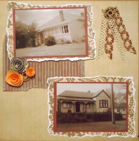
Family Homes by Wendy Johnson
Wendy has scrapped a layout of her paternal and maternal family homes.  A great way to remember how things were, and all those stories that went with them.  Using tearing and inking as a distressing technique to age her layout, Wendy has also added braid to compliment the colour theme.
A little corrugation behind Wendy's handmade rolled flowers adds texture.  A great effort Wendy, and I'm looking forward to sharing more of your fantastic old, old photos soon!
Sketch Challenge
Roof Tops by Deb Blunden
Deb has wandered the Albury city looking for interesting stonework to photograph, and these rooftops had us all thinking about what we actually see when we look around.  It's amazing what catches our eye when we're out and about.  A great contrast in the actual photos, with a soft background of blue tones behind.  Well done Deb.
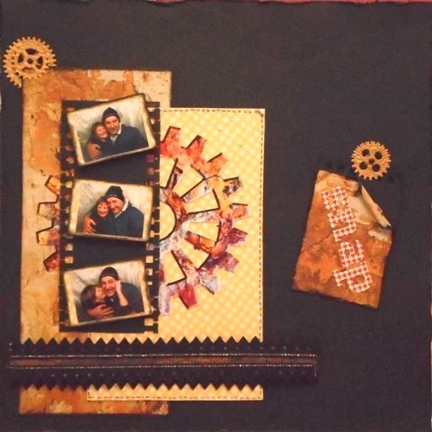
Babushka Nesting Dolls by Judy Laracy
Judy has used lots of white space and a couple of bright colours to highlight the little Babushka Nesting Dolls in the photo strip.  The brightness of the colours is crisp and pays a nice compliment to the dolls.
Adding a journalling tag is ideal for adding information, and Judy has done just that to tell her story of the Babushka history.  well done Judy.

Don't forget to pop a comment at the bottom for the girls - we LOVE comments!

Janet

Apr 17, 2014

April Sketch Post # 3

Sketch Challenge
Snap by Janet Watt (CT)
It's always exciting when I finally get some time to scrap, and I have managed to do this on the weekend with a great bunch of girls. The sketch was perfect for doing a page of a session in the photo booth for Blokey Man and I at a 40th we attended. (yes, he wore the beanie...)
This border punch is so versatile, and adds character to the theme. I LOVE these cogs, and they come in many colours/designs. Gave the fussy cutting skills a good workout. The AC adhesive fabric makes a nice background against the grungy weathered patterned paper.
A little layering on the trim strip gives dimension, and some distressing and inking on the tag adds to the theme.
Shadows of Self by Zan Boyle 
 
Zan has flipped her page, using an interesting series of photos taken of her shadow in difference stances.  The colour theme has muted tones to blend in with the photos.
Some decorative edging balances the photo strip.  The background masking of the bricks works in well to pick up the paving, whilst a bit of hole punching and bling around the edges works well too.
Loving that paperclip and tag, and who could go past that stamp?  Any person worthy of breathing fresh air would know the answer to that, right?...

A great comparison of the sketch, which is great to see.  We have lots more to come so get them in everyone.

Janet