Mar 31, 2014

March Sketch Post #7

Here we are with our last post for the March Sketch challenges. Thanks to everyone who had a challenge entry in. Now, to check out these challenges before Pumpkin Time, which is very close!
Mokoro Trip by Helen Triglone
That waterlily is just stunning Helen, and the wooden hand carved canoe such an iconic symbol for that area.
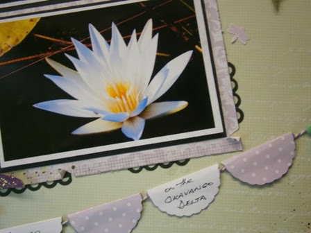
An interesting way to add a bit more with the bunting shaped from scalloped circles.  Another look at that photo, and a nice addition of the decorative border punch to blend in with the colour toning.
And then there is the delicate addition of skeleton leaves and the soft lilac petals. working in so nicely with the photo frame.  Well done Helen.
Card by Jane Huhta (CT)
The colours in this card are just so bright and cheery, they really make the card jump out at you. Apart from the dodgy photography, the inking, layered clouds and panels have come together so well. Well done Jane.

Thanks again everyone, we'll be announcing a winner in the next few days!
Janet

Mar 28, 2014

March Sketch Post #8

Hi everyone, we are nearing the end of our March Sketch challenge, but we still have a few to share.  Below you can see this gorgeous layout from Jane, based in a black & white theme, with the addition of pale blue.
Selfies by Jane Huhta (CT)
Jane's film strip is a great way to incorporate more photos into a layout.  The fact that they're elusive teenage selfies is even better!  
The addition of light blue elements is just enough to add another colour, and a bit of depth with layering or placement.
How great are these paper straws?  They look fantastic and the patterns and colours are just so in trend at the moment.  Partnered with these papers just brings it all together so well.   Lovely page Jane!

Don't forget, Pumpkin Time is March 31st, and it's coming up fast!

Janet

Mar 24, 2014

MARCH / APRIL SCRAPBURSTS

The ScrapBursts are without a doubt one of the Challenges I love most here at Scrapville, and seeing what everyone comes up with is always exciting. All the Challenges have a small window of criteria to meet in each category, and in doing so they will be accepted into each challenge.  Join in for some creative fun, Pumpkin Time is April 30th, and we have started a little earlier to give everyone a headstart with Easter and School Holidays looming nearer!  Check these out and let's get started!

LAYOUTS
#1 NUMBERS - THEME OF YOUR CHOICE

  • 1X MISTING/MASKING
  • 2X PATTERNED PAPERS
  • 3X PHOTOS
  • 4 WORD TITLE
  • 5X EMBELLISHMENTS
#2 VINTAGE/HERITAGE
#3 SOMETHING RURAL with TEXTURES
#4 WHITE with LIGHT BLUE & LINES


CARDS
#1 BABY BOY/GIRL
#2 VINTAGE/DOILIES
#3 WASHI/STAMPS
#4 WHITE with LIGHT GREEN


You can only have one entry in each Challenge (4 x ScrapBursts (layouts), 4 x CardBursts (cards)).  The entry must be your own work, and created specifically for the ScrapBursts.
The entry must meet all the requirements of each Challenge to qualify.  You may add Techniques to your Challenges such as:

  • inking 
  • painting/texture
  • misting/masking
  • stamping
  • stitching/sewing 
  • die cutting 
  • embossing
  • distressing
  • handmade

Should you have any queries with these just send me an email with "ScrapBursts" in the subject line, or call in.

Please assume that all Card Bursts must have a "Sentiment", whether stated or not.  Please assume that all ScrapBursts must have a "Title", whether stated or not.  Please link any entries you share back to Scrapville.  ALL ScrapBurst and Card Burst Challenge Winners will receive a Prize Pack.


Here are a couple of samples to get you all enthused and inspired. We'll have more to share from the Team as we go along.
#3 SOMETHING RURAL with TEXTURES
Durras - Batemans Bay by Jane Huhta (CT)
Jane's layout has excellent colour tones.  The rustic look of the tin and dilapidated framework is picked up in the elements added to the page.  The inking over the chicken wire mask breaks the white space, and the distressed, torn and inked edges of the page frame have a nice depth of colour.
The mounting of this photo is well blended with adorned webbing, crimped cardstock and mounted on a chocolate cardstock backing.  The richness of the rusty cardstock is just enough to tie in with the photo.
Loving that brick mask and texture, it looks awesome.  A bit of inking adds a rustic look, the crimped cardstock in the foreground has been torn, with added twine, a natural button, Kraft tag and torn strip of co-ordinating paper. Such a lovely page Jane, well done.
#2 VINTAGE/DOILIES
Be Inspiring Card by Sally Clark (CT)
Doily...I used a round paper doily, inked the edges using Vintage Photo Distress Ink and wrapped the doily around the card for an all-over effect.  The 'scrap' of printed paper on the card front was the perfect size...with a bit of Glimmer Mist, sponging and light stamping it was PERFECT!  The message was a left-over sticker from a monthly pack and I thought it worked very well.
3 layers of small scallop circles from a dictionary page, scrunched, inked and misted made the perfect accompaniment to the rest of the elements on the card.
 
Button...I found an old flower button (possibly my Grandma's) that was very WHITE but came up nicely with a spray of Soft Suede Glimmer Mist and a bling centre.
A couple of great samples to get you all inspired and ready to get started. Don't forget, you have until Pumpkin Time April 30th to get these in.  Have fun everyone!

Mar 19, 2014

March Sketch Post #6

Today we have layout sketches to share.
Funny Faces by Sally Clark (CT)
It just goes without saying really, point a camera at a boy and watch him make you cringe!  Personally I get a lot of "hand" shots in the lense.........  So appropriately titled, a younger, cheeky Alex is adorned with natural earthy tones, inked and splotched, a little tearing and distressing and then a touch of bold red to tie in with the belt.  A great looking page for a boy or earthy toned page.
The use of a spatter stamp can give an interesting effect when wanting a "drippy or spattered" look without adding wetness to the paper.
Sal has given her Cricut a workout cutting out her flourishes and title, then applying a little Glossy Accents for that glassy, shiny look.
 Gypsy Bay by Zan Boyle
Zan has used a brilliant background paper to work her sketch in.  It has made the whole page come together so well, matching colour tones with a maritime theme.  The corrugated boxboard adds a natural element and texture.  Actually part of a double page, Zan has done a great job with this layout.
The webbing looks great, and the lighthouse is a nice touch.  The blue/green floss sits well, and the diecut shapes fit in well too.

Lovely work girls, thanks for sharing.

Janet

Mar 18, 2014

March Sketch Post #5

Here is the latest entries for our Sketch challenges.
Residency Granted by Deb Blunden
Such a great take on the Sketch, using Aussie themed papers and a rugged outdoor look.  The corrugated boxboard blends in so well, the layering sitting well on the page.  Well done Deb.
Believe in your Dreams Card by Sally Clark (CT)
Love the colours in this card, the vibrant stripes behind the solids blend so well.  The bakers twine looks great, and the inking on the edges are well blended to balance all the layers.
How great does this sentiment scroll look?  A little creative thought in adhering the scroll with a wave like effect gives it more depth and movements.  Great work Sal.

Loving the work everyone is doing, the Sketch Challenge entries are great.  We'll have more soon!

Janet

Mar 13, 2014

March Sketch Post #4

We have more sketches to share with you all today, with a little added variety.
Love Card by Jennie Seal (GCT)
Jennie has used burnt orange tones mixed with kraft and black.  The inking helps to define the embossing, patterns and edgings. The rolled flower lifts the dimension of the card, and sets a nice balance to the centre of the card as well.  Flowers are just the nicest thing to add to any card, especially when you can make your own.  Well done Jennie. 
Hello Card by Di Corbitt
Di's card uses kraft tones as well, complimented with silver and greys. I am loving that hessian, nicely frayed top and bottom and coloured silver. The handmade flower has been created by Di from a mixed media technique, with a threaded button added on top for a bit more colour. The lightness of the background strip finishes it off nicely, which is also added onto the sentiment. Well done Di.
Show & Tell
This is another card that Jennie has made using the Sketch as a starting point.  This gives you all an idea of how you can often change up the sketches to create something different when you run out of ideas.  With this one Jennie has gone classic black & white, moved her sentiment higher for balance, and complimenting the file tag with a bow.
With Thanks by Jennie Seal (GCT)
Black & White always looks classy, and although the background is patterned it is still quite effective with just the sentiment mounted.  Thanks for sharing Jennie.

Pumpkin Time is 31st March, so keep them coming!

Janet

March Sketch Post #3

Today we have some cards to share for the Sketch challenge. I hope you are enjoying the posts, and find time to get yours in.
Thankful Card by Zan Boyle
Zan has used a step card for her Thankful card challenge, choosing a combination of orange toned papers and inking.  The distressing has lifted the inked edges with a richness, and the birds in the patterned paper make a nice soft balance, along with the cutouts and white picket fence.  Well done Zan.
Happy Birthday Card by Judy Laracy
Judy has gone for classic black & white with her Birthday card.  The foreground birds look great layered up in alternate colours, and tie in very well with the background floral lace pattern.  A bit of faux stitching and mounting of the sentiments gives it more dimension, and an overall elegant and classic look.  Well done Judy.

Thanks for sharing girls, and we have more to come...

Janet

Mar 11, 2014

March Sketch Post #2

Hello everyone, today we have another Sketch challenge to share.
Laugh by Di Corbitt
These papers come from the lovely Porcelain range from Basic Grey.  Di has used border punching on both sides, adding a little hit and miss technique to give the edges more character.  I think this ties in well with the lace background in the patterned paper.  The roses are given shine with some Glossy Accents, and the chip title says it all in a lovely scripted font, reflecting directly to the fun photos.
The layered edges have been distressed and inked, adding character.  This lace is gorgeous, and marries well with the Washi Tape above.
A closer look at the side border gives you that tattered look, and the top embellishment has tied in just nicely with the rest of the layout.  Well done Di, a lovely layout of the girls.

We will have more to share shortly.

Janet

Mar 7, 2014

March Sketch Post #1

Have you started yours yet?  Here is our first post for the Sketch Challenge with a layout from Jennie.  Despite the dodgy photography the contrast of the white space and greys really looks stunning.
by Jennie Seal (GCT)
The stamped chevrons make a great background, and looks so effective on the white.  There's more to framing a photo when you use dies.  The decorative frame looks very delicate and the corner flourish has added more texture with some dry embossing.
A border of threads and punched flowers add to to the softness of the little Flower Girls posies in the photos, inking and pearl centres give the flowers more depth.
Don't these just look gorgeous?  Purchased as a little set at Scrapville they'll sit nicely on any straight edge, and make such a nice compliment to the page.  The stamping in the background blends well with the colour tones and the chevrons.

A great looking page Jennie, and a great interpretation of the Sketch.  I can't wait to see what else we'll be sharing.

Janet

Mar 3, 2014

March 2014 Sketches

Hi everyone, here are our latest Sketch challenges for March.  You have until Pumpkin Time on March 31st to get them in.  I hope you enjoy the challenge.
March Layout Sketch
March Card Sketch
Have fun everyone!

Janet