Showing posts with label Updates CT. Show all posts

Jun 10, 2014

June Post #1

Hi everyone, it's been a little grim on the blogging side of things lately as I am still without internet services. Whilst Telstra sorts through ongoing issues for the third week, I have been unable to access the 'net at all from work.  With a little dose of "family flu" on top of that, the energy levels are finally starting to life.  Alas, we are behind the ball in all sorts of posts!   So to catch up I'm just going to upload some of the wonderful work that has been coming in to Scrapville, whether it be via challenges or our classes.  
Little Man by Jane Huhta (CT)


Just for You Card by Jane Huhta (CT)
Bon Voyage Card by Zan Boyle
The following layouts are from our classes, so I hope you enjoy the girls work.
Mixed Media Techniques 1
Fragile by Jennie Seal (CT)


Sunshine by Judy Laracy

Happy by Roz Langridge
Some really great work, and I would like to thank all those that have taken part in our classes and challenges.  As always, it's an exciting anticipation to see what the girls come up with.  The MMT classes prove that, especially once the girls have added their own touches.

I will be posting more when I get the chance, so bear with me whilst I juggle to time it takes to get these up.

cheers
Janet

Apr 30, 2014

April ScrapBurst Post #10

SB #3 Something Rural with Texture
Rustic by Jennie Seal (CT)
How good does this page look?  That water tank background paper has worked a treat, blending in really well with the overall theme for those earthy, rustic wire coils.  The screw brads always look good on a male or rustic page, and also the wooden gears.
These gorgeous little die cut birds are touched up with a bit of glossy accents, whilst the gauze in the corner has been coloured and scrunched for texture.
Wood and metals embellies are a nice team to compliment a rustic page, and these all work well, right down to the chain.  Well done Jennie.
Layout by Roz Langridge
It's great to see all these wonderful old photos coming out for the ScrapBursts.  These harvest photos are giving us all a chance to see how much our lives have changed over time, and appreciate our heritage.  Love the photos.
Now these may be a little difficult to see, but the wheat is handmade with tissue paper.  They look fantastic, and add to the texture of the corrugated backing cardboard.
The grass reeds have been cut from a die, and give the page plenty of movement with a great feel of the outdoors.  The little bird is really cute, and I love how this has come together.   Great work Roz. 
CB #1 Baby Girl
Hello Baby Card by Jennie Seal (CT)
Jennie's baby girl card has been given added depth and texture with dry embossing dots, and die cut onesies and the pram.  A little mounting tape and they help the card to "pop".  Well done Jennie.
SB #2 Vintage/Heritage
Memory by Di Corbitt
Di is another of our ladies who have a great range of heritage photos, and this is a wonderful photo of her mother as a child, on her mother's knee.  The papers reflect the colours and theme to suit the era, with an eclectic mix of tags and embellishments to match.  The layout has been kept simply minimal, with the full focus on the photo.  Well done Di.

Thanks for sharing girls.
Janet

April Sketch Post #6

Hello all, here is our next Sketch post.  I hope you are enjoying all the work that these creative girls are putting in.
Happy Snap by Jennie Seal (CT)
Jennie's layout uses natural colour tones with a background of white space. The brown hues are a lovely compliment to the textures in the patterned papers, and Jennie's added elements.

Lots of die cut cogs create a background to the film strip, which displays a succession in growth years of her favourite son.
All the fussy cutting to the edges of the woven paper leaves a rawness to it's edging.  The stamping at the bottom adds texture once embossed, adding another layer.  A great interpretation of the sketch Jennie, well done.

Have a Wonderful Day Card by Zan Boyle
Zan has used such a lovely quote on her card.  Layering with different elements gives it direct focus, drawing focus to the meaning.  The colours coordinate perfectley, well done Zan.
A Perfect Day by Di Corbitt
Di has turned her sketch, using her photos along the bottom instead.  Replacing cogs with ladybirds and scallops has given the layout a different look, more suitable to Di's girly photos.  The colours also work well together, thanks Di.

Great to see so many entries, thanks to everyone for playing along.
Janet

Apr 29, 2014

April ScrapBurst Post #9

CB #3Washi/Stamps
Time to Celebrate Card by Zan Boyle
What a versatile Washi this is, it just keeps popping up all over the place.  Clock faces, watches, steampunk, it's all so out there at the moment.  Zan has done a great job with her stamping, use of Washi and fussy cutting.
SB #1 Numbers
Tayla Turned Six Today by Di Corbitt
It's all about the pink!  Di has used lots of pink and girly touches to create Tayla's birthday layout.  The birdcage stamp in the background blends in nicely, and all the little embellies add to girls' fun day.
SB #4 White with Light Blue & Lines
Alfie by Roz Langridge
Roz has put up a lovely page of Alfie, using basic elements to highlight the criteria.  The blue and white circles look great layered and blinged up, and the addition of the stripes fits in with the lines.  This has come together very nicely, well done Roz.
CB #3 - Washi/Stamps
Happy Birthday Card by Jennie Seal (CT)
Jennie has shown us the extend of a good Washi supply!  The colours are vibrant and colourful, with a friendly feathered fellow on the front.  Also a good way to use up those last little bits and strips.  Well done Jennie, bright and fun.

Thanks for looking.

Apr 11, 2014

April ScrapBursts - Post #4

April ScrapBursts
CB #4 - White with Light Green
Learn Live Hope by Sally Clark (CT)
Sally has used tearing and layering on her card, distressing the edges and shading with inks. A scattering of bling adds a nice sparkle to the front as well, with three gorgeous little dragonflies fluttering along the bottom.
The layered bunting is mounted up on a darker cardstock, with the torn edges on the panels distressed on the bottom section.
Sally has continued the design on the inside of the card, using a thin scattering of bling here as well.  Lovely card Sal, great layout of the colours.

Stay tuned, there's plenty more to come yet!

Janet

Apr 10, 2014

April ScrapBursts Post #3

Well here we are at the third ScrapBurst post with some more layouts.  I am loving what the girls have been creating, and hope that you are all enjoying the ScrapBurst challenges.  I'm sure the variety of the challenges will give your layouts and cards lots of scope.  And above all, have fun doing them!
SB #2 - Vintage/Heritage
Love by Jennie Seal (CT)
Jennie's layout has combined mixed media techniques with stamping, metal embellies, doilies and layering.
The photo has been framed and mounted up, with doilies and metals to finish off the look.  The difference in textures is quite effective, giving both an aged and delicate feel.
The title is a wood word, inked up.  The background has been masked onto a Gesso background, with the masking coloured in a soft fawny hue.  Lovely colour tones Jennie, a great Heritage page.
CB #2 Vintage/Doilies
Always and Forever Card by Isabel Bradbury
These are such beautiful doilies, and the colour selection here at Scrapville is fantastic.  Isabel has layered and offset her doilies, and surrounded them with a lovely sentiment.  A lovely card.

Thanks for sharing girls.

Janet

April ScrapBursts - Post #2

ScrapBursts
CB #1 Baby Boy/Girl Card
Baby Boy Card by Sally Clark (CT)
Sally's baby card uses different patterned papers and cardstock in blues, with just a touch of colour.  The darker mounting gives the front panel more definition. 
The title alphas have been given a layer of Glossy Accents to add a bit of shine.  Adhered to a decorative frame in a darker blue has made the title stand out even more. 
Sally has used a rolling technique on the corners, adding a decorative corner punch with a little bling.  A nice touch, and not too much for a boy card.

Stay tuned, there is lots more to come!

Janet


Apr 9, 2014

April Sketch Post #2

Today we are sharing some challenges from the April Sketches. I hope you're all having fun with this one!
Happy Birthday Card by Jennie Seal (CT)
Jennie has used black and white to complete her card sketch.  The little owl in the same colour tones adds a really nice touch.
The cogs looks very effective with their mounted metal toppers and doodling in the centres. The chequered ribbon give the a real blokey touch, finishing off with the black ric rac.  Well done Jennie.

Mar 28, 2014

March Sketch Post #8

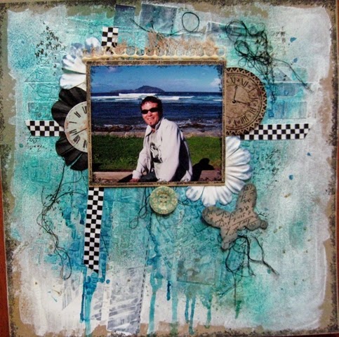
Hi everyone, we are nearing the end of our March Sketch challenge, but we still have a few to share.  Below you can see this gorgeous layout from Jane, based in a black & white theme, with the addition of pale blue.
Selfies by Jane Huhta (CT)
Jane's film strip is a great way to incorporate more photos into a layout.  The fact that they're elusive teenage selfies is even better!  
The addition of light blue elements is just enough to add another colour, and a bit of depth with layering or placement.
How great are these paper straws?  They look fantastic and the patterns and colours are just so in trend at the moment.  Partnered with these papers just brings it all together so well.   Lovely page Jane!

Don't forget, Pumpkin Time is March 31st, and it's coming up fast!

Janet

Mar 19, 2014

March Sketch Post #6

Today we have layout sketches to share.
Funny Faces by Sally Clark (CT)
It just goes without saying really, point a camera at a boy and watch him make you cringe!  Personally I get a lot of "hand" shots in the lense.........  So appropriately titled, a younger, cheeky Alex is adorned with natural earthy tones, inked and splotched, a little tearing and distressing and then a touch of bold red to tie in with the belt.  A great looking page for a boy or earthy toned page.
The use of a spatter stamp can give an interesting effect when wanting a "drippy or spattered" look without adding wetness to the paper.
Sal has given her Cricut a workout cutting out her flourishes and title, then applying a little Glossy Accents for that glassy, shiny look.
 Gypsy Bay by Zan Boyle
Zan has used a brilliant background paper to work her sketch in.  It has made the whole page come together so well, matching colour tones with a maritime theme.  The corrugated boxboard adds a natural element and texture.  Actually part of a double page, Zan has done a great job with this layout.
The webbing looks great, and the lighthouse is a nice touch.  The blue/green floss sits well, and the diecut shapes fit in well too.

Lovely work girls, thanks for sharing.

Janet

Mar 7, 2014

March Sketch Post #1

Have you started yours yet?  Here is our first post for the Sketch Challenge with a layout from Jennie.  Despite the dodgy photography the contrast of the white space and greys really looks stunning.
by Jennie Seal (GCT)
The stamped chevrons make a great background, and looks so effective on the white.  There's more to framing a photo when you use dies.  The decorative frame looks very delicate and the corner flourish has added more texture with some dry embossing.
A border of threads and punched flowers add to to the softness of the little Flower Girls posies in the photos, inking and pearl centres give the flowers more depth.
Don't these just look gorgeous?  Purchased as a little set at Scrapville they'll sit nicely on any straight edge, and make such a nice compliment to the page.  The stamping in the background blends well with the colour tones and the chevrons.

A great looking page Jennie, and a great interpretation of the Sketch.  I can't wait to see what else we'll be sharing.

Janet