Hello all, here is our next Sketch post. I hope you are enjoying all the work that these creative girls are putting in.
Happy Snap by Jennie Seal (CT)
Jennie's layout uses natural colour tones with a background of white space. The brown hues are a lovely compliment to the textures in the patterned papers, and Jennie's added elements.
Lots of die cut cogs create a background to the film strip, which displays a succession in growth years of her favourite son.
All the fussy cutting to the edges of the woven paper leaves a rawness to it's edging. The stamping at the bottom adds texture once embossed, adding another layer. A great interpretation of the sketch Jennie, well done.
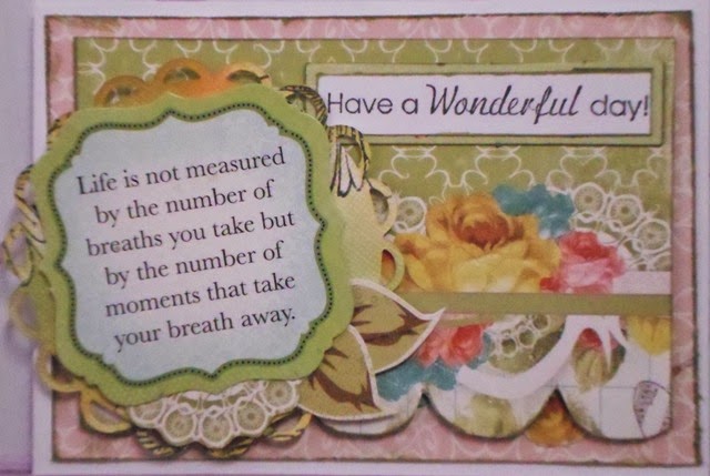
Have a Wonderful Day Card by Zan Boyle
Zan has used such a lovely quote on her card. Layering with different elements gives it direct focus, drawing focus to the meaning. The colours coordinate perfectley, well done Zan.
A Perfect Day by Di Corbitt
Di has turned her sketch, using her photos along the bottom instead. Replacing cogs with ladybirds and scallops has given the layout a different look, more suitable to Di's girly photos. The colours also work well together, thanks Di.
Great to see so many entries, thanks to everyone for playing along.
Janet


1 comment:
Zan Love your clocks.Great Card
Di Love the sequence sports day pics.Great interpretations of sketch
Post a Comment